
When you’re driving in America, speed limits are posted in miles per hour. This makes sense. When you’re on a highway, you’re likely driving for more than a minute or two. Maybe you’ll be on the road for fifteen minutes. Or maybe you’ll be driving for a couple of hours. Either way, the sign puts a limit on your speed in terms that match your activity. Driving at sixty-five miles per hour? In an hour, you’ll be sixty-five miles down the road. Simple. Intuitive. Useful.
Speed limits could be posted differently, however. How about a speed limit of no faster than “95 feet per second”? That’s a mathematical equivalent of a sixty-five miles per hour limit. But it doesn’t tell you anything useful. Nobody that I know thinks about their driving on a feet-per-second basis. And we shouldn’t, because nobody drives a car down a highway for just a few seconds at a time.
The Annual Return Figure: How It Can Lead To Bad Decision Making
The investment community has long reported returns on an annual basis. These numbers show up everywhere; fund fact sheets, the financial media, financial plans.
And while the numbers may be accurate, I think they’re like posting a highway speed limit in feet per second. The unit is often wrong for what you’re actually doing.
For example, you have probably heard that over the long term stocks (including reinvested dividends) have historically returned about 10% annually, while bonds have returned about 5%. On an annual basis, the difference between 10% and 5% doesn’t sound like much. Invest a thousand dollars in stocks, you’ve got $1,100 after a year. Invest in bonds, you’ve got $1,050. A fifty-dollar difference.
Now layer in the risk. You’re told that for that additional $50 you earn with stocks, you have to accept much greater volatility. Meaning the value of your stocks can drop 50% or more in a bad year. They’ve basically done that a few times in the last thirty years. Bonds, you’re told, are much safer. They historically haven’t fallen in value nearly as much, never getting close to that 50% drop in stock values.
So, you could very reasonably look at these numbers and conclude that bonds are the smarter choice. Why take that kind of risk for an extra fifty bucks?
That conclusion is logical. But it could be a catastrophically wrong decision. Made because the way the information is framed makes it look right.
Linear Brains In An Exponential World
The problem is that our brains are designed for a linear world. If something is twice as fast, we expect it to get there in half the time. If something returns twice as much per year, we expect twice as much at the end.
But compounding investment returns don’t follow linear logic. Compounding values curve upwards. Slowly at first, then violently. And the true power of compounding is most clearly evident only over sufficiently long periods of time, distinct from the base annual unit that we all default to when quoting investment returns. No amount of intelligence protects you from this.
The Investment Cheat Sheet
To solve this problem, let’s take a range of annual return figures – from 2% to 14% – and translate them on a “Cheat Sheet” into the equivalent of “multiples of money” earned on your investment over the appropriately longer periods of time that investors should be thinking about.
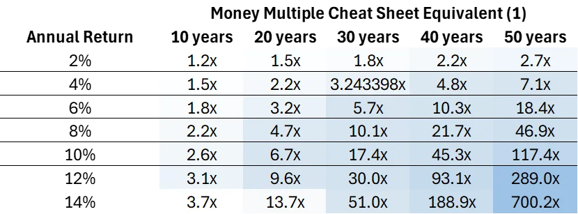
Invest $1,000 and generate a 4% return? After 30 years, you will end up with 3.2x your original investment, or around $3,200 ($3,243.39 to be exact, as I’m rounding to the nearest $100 for these multiples).
Invest $10,000 and generate a 10% return over 20 years? You will have a bit more than $67,000.
How might you use this cheat sheet?
Take a 30-year old law firm associate looking at the investment choices in their 401k for their current year contribution of $24,500. Whether they realize it or not, they are making an investment decision which should properly be measured in decades, even half a century or more (as a 30-year old would have an actuarially expected life span beyond 80 years old, i.e., 50+ years into the future).
With this cheat sheet, that lawyer will more clearly see the potential results of a decision to invest in one fund vs. another. Invest in that conservative bond fund that ends up generating a 4% annual compound return and your $24,500 will grow to $174,000 after 50 years. Or invest that same $24,500 into that more aggressive stock fund that generates a 10% annual compound return and end up with over $2.8 million. The difference in wealth generated via one fund selection vs. another could be life changing. (1)
The financial industry isn’t lying to you. It’s doing something more subtle and potentially more damaging. It’s framing truthful numbers in a unit that could lead you to the wrong conclusion. Print this blog post out. Tape it to the inside of a desk drawer. The next time you’re reviewing your portfolio or making an investment decision, pull it out and remind yourself what those annual return figures actually mean over the time horizons that matter. You’re just not driving to the corner store.
Footnotes:
(1) The returns shown are for illustrative purposes only and are based on hypothetical annual compounding returns ranging from 4% to 14% over the time periods indicated. These figures do not represent the performance of any specific investment or portfolio. Actual investment results will vary and may be significantly higher or lower than the amounts shown. The examples assume a constant rate of return and do not reflect the impact of market volatility, investment timing, taxes, fees, expenses, or other factors that can materially affect performance.